Hi, everyone. Blogger has been acting a straight fool lately and I've been impatient with it. I don't know what the issue is, but nothing’s loading properly--including this new blog post on my latest drawing. Nonetheless, I think I'm there. I think it’s doing its job, and now it’s time to share my process again through a series of images.
I've named this image Fleur. The character’s name is still unavailable to me.
I sketched the actual drawing probably three months ago and just left it, for some reason. Therefore, I don’t have the penciled version. Nonetheless, as of recently, I went through the process of inking the drawing and adding all the particular areas that would require shading/shadows regarding the flesh (I use Copic markers for this). Besides using the usual colored pencils to add tones to the eyes, I also used a screen/pattern early within the process as the backdrop. Because the process only gets messier, I try to have this construction part out of the way as early as possible. Anyway, at first I meant to apply the screen/pattern as the shirt, and then realized there wasn’t enough paper. I like it better as a backdrop, though. So having carefully carved out the negative space, I added it on as needed.

Now on to the colors. Water coloring is always my base of choice because it’s light and covers space quick and easily. Because I decided his shirt would be yellow—in semi-accordance with the gold fleur de lis within the backdrop—I painted it a light yellow. Just as his hair would be brown, I gave it a light-brown color. However, as seen, I covered the hair with a dust of brown-toned chalk pastels before I applied the yellow chalk to his shirt. I’m all about layers. Get the base color, and then add more and more colors!

Because I like layers, I try to add the darkest color first when it comes to chalk pastels. Why? Because it can get messy. Adding the dark color first allows me to clean up the edges before applying lighter colors. As seen in this image, I added a yellow chalk pastel to his shirt as well as a flesh color to his skin tone. As for the hair, it was time for a layer of colored pencils toned and streaked through his hair to give it vibrancy (I eventually use a tissue to blend the three mediums that layers the hair). Furthermore, I used wooden beads and brown string to craft the drawstring area of his shirt. As for his undershirt, I applied a ragged piece of actual denim to give it form.

Almost finished. I streaked his hair with a gum eraser as a form of highlights, and then gave sparks (an actual whiteout pen) and further flourishes to his eyes and the glisten of his lips. On the crafting aspect, I used more string to construct him gently gripping a necklace consisting of bejeweling stickers, and a gold cross sticker. I went through several designs of the cross from what I had available before I decided to stick with a gold one. This cross, in particular, matches his earrings, which are also stickers taken from the same batch.

The final part. Immediately, after I scan a drawing, I revive its color in PhotoFiltre. Hey, it’s all I got. The reason I do so is because digital images come out differently than the original. So I found it best to give some digital brilliance to the colors. Nevertheless, because the image is further decreased to portrait size, I also made corrections and adjustments. One of those corrects were to brush a matching brown color over the wooden beads that makes up the drawstring of his shirt. This was to cover the dry crafts glue peeking out. Other adjustments called because certain aspects tugged at me. Like his lips. I brushed over the glisten I originally intended, deciding it looked best without. I also touched up the glisten in his eyes by applying a softer gray over them to bring down the brilliance. Sometimes you have to make little adjustments as the digital image always looks differently than the actual one. A little clean up in an otherwise never-perfect drawing.
I have about four other images I’ll be sending off before turning them into journals and other items on my Zazzle shop, this one included. Until then, let’s come up with a name for him.
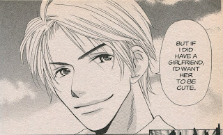
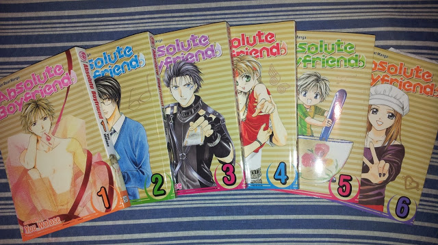
I sometimes get message from people asking me what inspires me to draw in this style. Then there are some who pinpoint it right away. In any regard, I idolize Naoko Takeuchi (Sailor Moon) and Miwa Ueda (Peach Girl) and their shojo manga drawings. I love the youthfulness, softness, and simplicity of shojo-themed drawings.


