What’s up, folks. So listen–err, read. Today I wanted to share how you can use the online design tool, Canva, to create easy thumbnails for your YouTube videos. Or at least how I create mine. Nonetheless, you always want an interesting thumbnail to grab viewer’s attention. Especially for those viewers who aren’t familiar with your content. When a video of yours pops up in viewer’s search or on their recommendations list, chances are a unique thumbnail will grab their attention. Especially a thumbnail with eye-popping color and an interesting composite representative of the actual content (no click baiting, please).
But enough of that. Let’s get started… (If images are too small, try clicking on them for a fuller scaled view).
1. First I suggest you grab a screenshot of what’s taking place in the video you plan on uploading. Different video editing programs have different methods of capturing a screenshot. But, with Windows Movie Maker, it’s as simple as clicking SNAPSHOT. Save the image wherever you please before logging into Canvas.
Okay. So to save someone the trouble, I present to you how to create the perfect size Spreadshirt banner. And it's all done via the online creation tool, Canva. This is for those who want a nice banner that stretches properly over their web shop. And not so much sitting above the fold as a box surrounded by negative space. (Anyone else hates that?)
First. Get into your Canva account. Duh, right? Anyway, in the top right-hand corner is the option of creating your own dimensions. You want that, as opposed to using the templates Canva has already prepared. Naturally, you’ll need to input the right width and height. Go for 1280 x 343 in pixel size.
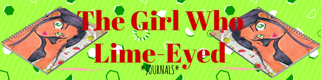
Cut. Clipped. Edged out of a piece of Bristol board to draw a smaller picture. Or what initially was going to be a mini-comic that just wouldn’t… mini! So instead, I sketched a quick drawing. As always, I found conflict with what to do with her hands. Nonetheless, I went for the simple and clean approach.
The inking followed. With no specific character in mind, I tossed around her eye color until I just decided to make them a limey green. And because she’s a person of color, I shadowed her a Copic Deep Orange. At first I wanted to leave her lips without lipstick, to instead go for a Copic Flesh Pink tone. But later, as you’ll see, that simpleness went out the window. Fact is, I love my girls flashy when it comes to lipstick, nail polish, etc. Anything outside of that seems… well… basic.
Now comes one of my favorite parts: scrapbook implementations. I’ve had this slice of cherry-themed paper for a while. It’s smaller than my usual pieces, so it’s hard to use on bigger projects. But since this was a smaller drawing–on a smaller piece of Bristol board–it fit perfectly. And because it’s been years since I use dollies, I thought adding the two would work this go-round. As always, I X-Acto Knifed her from the negative space. Which, thankfully, wasn’t much nor complicated.
Color. Color. Color. Paint and pastels. Layers on layers. Where to start? Okay. Her eyes have my traditional gradient effect. The theme–as mentioned–is lime. Lips colored soft pink alongside a darker shade of pink for her nails. Her skin tone has a soften blend of clay-colored chalk pastels mixed with a peach. To be honest, I had these scrapings (I used my X-Acto Knife to scrap chalk pastels into a pallet before blending) left over from my last drawing HERE. I saved them, and had just enough for this girl. I water colored her hair purple, which is tradition for me when drawing characters with dark hair. Following the watercolor, I spotted her hair with black chalk pastel. It always looks a little rustic look until I blend.
More layers. Gave ground to her pupils, and an iris effect where I black-dot around her full iris (not sure where I learned that from). Also, and it’s been a while, but I added eye shadow using a soft rub of pink chalk pastels. Too much? Maybe. I followed my tradition of using three colored pencils to streak and layer her hair. But I felt like I missed the flow around the part where she tucked her hair behind her ear. There needed to be some definition on where that piece of hair broke from the rest of the flow. So you can see where I added a darker line to separate the two. But from there, I got into this mood of using the black colored pencil to begin adding more fullness by shading her hair more with it. Experimenting I guess.
So yeah. Basically got to the final step, scanned, and realized she wasn’t complete. Pulling the drawing out of the scanner, I add the stickers. I’ve always wanted to use these–as the majority of them were featured my older project HERE. The left overs made it to this girl in the form of a cherry earring and floating fruit. In other words: CUTENESS IN EFFECT! No, for real. I love stuff like floating fruit.
But yes. In its digital process I added:
1. Revived her color for the digital look.
2. Retracing and filling her outline and other dark areas outside of her hair.
3. Filling her lips and nails with color before highlighting their shine with a touch of white.
I believe that’s just about it. So what should her name be?
Also, you can buy a journal featuring this drawing at my Zazzle Store HERE!
Oh what an interestingly long break I took from actually drawing a cartoon. Ridiculously long, rather. Actually, chalk my inactivity up to laziness. But I’m back in form. Spurred by my new found freedom to do what I want to do with my immediate time. (We’ll save that story for another day.) I’ve been sitting on this no-body character for months, before I lit a fire to do something with it. Lots of sketching, erasing, playing around with different poses took place. Soon I got to this selfie-taking, disco-spinning point. My original inspiration was this picture of singer Laura Branigan. I’m a huge fan of this long-gone and underappreciated singer from the 80s and early 90s. So, spinning through her records (well MP3 files), I searched for a picture of her to embody in my own cartoons. And I liked this one. So I got started, took that long no-drawing break I mentioned, and never actually broke through to my inspired thought. Except for sketching the tousled hair, I abandoned the drawing. I had a hard time getting her body down. Then again, I’m not great at bodies. But I gave it a good go...
The pencil and sketching part is where I usually spend most of my time–and expelling frustrations. As mentioned, lots of erasing, redrawing, and standing before a mirror to calculate proportions. Which is beyond my skill as far as I’m concerned. But I love a good challenge. Good or bad, sometimes I just brush my frustrations aside and just go for it. I’ve long stopped battling drawing insecurities. Really, you have to close the lid on it after a point. Or you’ll never get anything done while stuck in the process. I’ve mentioned this before, but your love for the craft will always be inside searching for another opportunity. Another burst of inspiration to express. So if you find yourself battling with insecurities about your skills, ignore it. Draw anyway. Go for it. And give your next effort your best. And the one after that. And after that. And so forth and so on.
I never really have a direction once I get pass the sketching phase–color and material wise. I don’t know which character speaks to me. Meaning, what hair/eye color I’ll need. As well as who fits what I kinda-sorta have in mind to convey the drawing (as well as which personality fits). I love combining crafting materials with drawings–with is apparent to those familiar with this blog. But something about this glittery sheet called me. I bought it two years ago, and I suppose for a occasion such as this. Seeing how the imagine draws inspiration by Brangian, it makes a fantastic 80’s disco-jammy top. The tousled hair from performing and the endorphin-heavy selfie to boot! Notice I gave her bottom eyelids some sharpness ala Diana Ross's album cover for Surrender. Not too much, but just a touch. (Hair was a bright, canary yellow watercolor. Shading done with "Baked Clay" Copic Marker.)
Speaking of Diana Ross, before I get into the next step I decided the character would be my girl, Towel. (My original baby.) They’re cartoons, so I give them any kind of name. With that said, a lot of people who’ve asked me about her thinks she’s a tanned white girl. The truth is actually the opposite. She’s black, having dyed her hair (her cousin Brooklyn’s idea.) I’m not into conventions and traditions when it regards appearances. I love individuality and differences. Things that aren't suppose to fit. Besides, Beyonce and Tamar has done the same with their heads. Now I'll proceed forward speaking on the usual, triple-layer gradient effect for her brown eyes. I didn’t use a blending pencil this time.
Per normal, I kind of struggled with chalk pastels when it came to nailing her complexion. I used a clay and a peachy blend–which is the safest balance for her tone. Balance is necessary; the darker the complexion, the less you can get away with blotchiness. And my drawings come LOADED with missteps. As seen. I would later have to go over her complexion with another round of pastels to even everything out.
I did her hair different this time. Instead of using a chalk pastel one tone up from the yellow base coating, I used a tan. (Carved the simple shirt outline out.)
I’ve had one bottle of craft’s glue since 2001! And when I went to glue the glittery sheet behind the board, nothing came out the bottle. No more glue. Which was a good thing because it would’ve been a pain. So I just taped the sheet down, which was a pain as well because my tape is so old it breaks as I peel. And to think, I left Michael’s last Saturday knowing I needed more than what I left with.
I added the third layer to her hair through a blend of three color pencils. Well, four counting the black I used to fill her roots. But I had concerns during the process. One: her hair was tousled and uneven. I didn’t know whether to regret it or fix it by adding more to her right side. Eventually, I said forget it. Perfection sucks and the story is she just left a performance where she was serving all kinds of vocal tease. Two: I couldn’t find its movement and flow as I added more streaks. So I did what I could. As for her cell phone: black marker for the back and a silver color pencil for the boarder. I knew I would embellish it later. A nice shade a pink filled her nails and lips.
Now, I got to remember what I added to this part of the process. OH! The background. I thought about a black background with a light effect via chalk pastels. I thought about adding another scrapbook sheet. Then, which happens often, I thought about how much I wanted to keep working on her instead. So I just painted it canary yellow and used pink chalk pastels to give her a iridescence that’s not so. To give her outfit form, I used a black marker to show the curve and folds. Then realize another round of disproportions and said “F” it and kept going. Telling you guys, you gotta just keep going.
The embellishing part is my favorite. I don’t know if I mentioned this before, but I once had an art teacher tell me to stop adding stuff to any of my drawings. I told him I’ll do what I please. I'll make mistakes and change my mind accordingly. If possible. In this case, I pulled those black chalk stickers off. It just… didn’t really work. I wanted to use them, but found it unnecessary for this particular drawing. Yet, I left the bejeweled necklace and earrings (all my girls have to wear jewelry). Of course, I added some to the back of her phone as well.
Okay. Okay. Okay. The not-so final product. Or almost. There’s so much I have to say about how I got here. Changes and all. So I’ll bullet point them for my own organization of thought.
1. My scanner only scans so much. That’s right. This was as much as I could capture. I’ve had the scanner for years and just never upgraded. You know, money and all. But, fact is, I like it. I’m all about face in the drawings, so I served. I had to choose between showing her hair or the cell phone more. Obviously I picked hair! As I live for a girl with locks and flow.
Now I tried to take the image on my phone (like the ones I shown of the process) and work from there. Yet, it didn’t turn out how I liked so I stuck with the scanned image. Until I can upgrade, I just have to use this. I lost a lot of the story, but still gave face.
2. As always, I revived its color in its digital format. Also, as mentioned, I went back and added more to her complexion. My first blending wasn’t that great in the original digital image.
3. I darkened her outline on the computer. I kept looking at the image knowing something was getting lost in digital translation. It was her outline for sure. I may continue to add this step to the process of future drawings. Add digital gloss to lips/nail/phone and brightened up the eyes more. Computer work is out of my field, but I use it for the smaller things. Convenience.
4. I didn’t clean up the areas where I removed the stickers. We’ll claim "added style" as the results.
I believe that’s it. What do you guys think? I was up and down about it for various reasons. Part of it consisting of insecurities speaking. But then I looked. And looked. And realized I loved the pronounced dark outline and the way I blended her hair. She looks like a Barbie doll. And her shirt makes me want a strawberry crisp popsicle. Later down the line I'll look into making changes.
Here we are with "The Girl Who Wanted Illumination." Character named, Shi Shi. Last weekend I came across another bundle of scrapbook paper and bejeweled stickers that I wanted to use. And here we go with my first shot...
Sketched. A touch difficult at first. However, the basis was "something cute."
Filling in her eyelids, the heel of my hand came in contact with some drying spots. So by accident, I splotched her face a little. My immediate reaction was to take the drawing and crumble it all up. But I kept going. There's always ways around these things, right? Nonetheless, I left the drawing alone for the night after that situation.
Minimal watercolor in use. Though I began to think what exactly was I going to do for her backdrop. Should I paint it? Paint around her?
In the spirit of my last drawing, I took another slice of bristol board and painted it a soft black. All materials gathered, I knifed out her clothes. Or the potential areas for clothes.
Seeing that I would glue her onto the black-painted board, I used tape to keep her "clothes" together. Too much glue everywhere is messy. Anyway, stenciling out the pieces were a breeze. Not complicated this time around.
Lovely. Chalk pastels are all colored and in place. Soft blue for the hair and a peach tone for skin. Layers.
I do not like the way I streaked her hair. It was so wavy and wild that I lost control of its movement. Also, I think I should've called it a night at this point. I was ready to lay down.
I can't say this will be the final look. I had troubles losing its scale with my tiny scanner. So I used lighting and my phone's camera to get a larger scale. So I'm not sure yet. I work with what I have. Nonetheless, I revived her coloring which gave her this inner illuminating appeal. Extra sparkle to her eyes, etc. I'm still on the fence about this one. Small things I maybe didn't do as well as I hoped earlier in the process seems to show. But then I look back and think she's too damn cute! She reminds me of Aja from Jem and the Holograms.
Video games have always been a stress reliever for me. Just about every suppressed aggravation comes out (usually through a stream of Southern dripped curse words) during moments of blasting zombies’ heads all over the damn place. Likewise, a simple rumination on my day with a quiet puzzle game is just as an effective reliever. When I think about it, one genre of gaming educe screaming release, whereas another allows me to play scenarios in my head pertaining to life and how I have to deal with some aspects of it. Furthermore, video games energize and engage me. They toil around with my imagination, feeding my creative ideas for writing, drawing and conceptualizing character scenes. For a moment–a microscopic, tiny moment–I'm transported somewhere else in an existence that is dangerous but never my own. It’s a vicarious way of living, with a slew of possible situations to explore. And while games are not always as mentally stimulating as reading (perhaps it‘s worth the debate); they do generate just enough to often times keep me from reading. (If you catch my drift.) So I've always wanted to share my gaming hobby, however casual it actually is. It’s a thrilling, wonderful tool to bring people with shared interest together. Okay. I mean if you love gaming and consider it a hobby. Nonetheless, as I start my gaming channel (or restart, really), I'd like to introduce my first videos encompassing Resident Evil Revelations 2. My favorite character in the series, Claire Redfield, is finally back! She finds herself locked up (once again) in a mysterious and creepy prison–one in which I've decided is a killing jar experiment…. Here’s what I think as I commentary my way through Resident Evil Revelations 2 Episode One: Penal Colony…
I mentioned a couple of post ago how I've been sitting around not drawing. I'd sketched an image and struggled for weeks trying to create it the way I'd envisioned it. Unfortunately, that process stalled completely. Friday I decided to just do it. To take whatever it was I had already done and keep going. There's no such thing as perfection after all. It's something that will forever remain elusive and paralyzing. So I'd rather keep creating. Anyway, I actually filmed the process of this particularly project, so until I update this post with the edited film, here are a few of the stills.
The usual inking and color outlining done. Just going with the flow on this one. Nothing particular in mind, except that I wanted dark, bushy-like eyebrows.
As always, I fill in the color of the eyes first. For some reason I do the eyes before letting everything else blossom. It may have something to do with how I'm inspired by Naoko Takeuchi. Nonetheless, I also colored areas of shade/shadow, and filled his top lip. I had a little problem with the ink not drying properly, so when I went to erase the penciling, some of the ink smeared.
Now time for the crafty part. I had a cousin over and, from a multitude of scrapbook paper, she picked up this denim background and a shimmery gold piece for his cap.
So I had to scalp him to get all the necessary pieces traced and put back together. Thankfully, he remains unbothered by the event. While the pieces were off, I dusted him with a fleshy yellow-tinted chalk pastel and a soft brown for his hair. I used a paper towel to even it all out.
Almost done. All the pieces glued in place now. I streaked his hair with a single black colored pencil and four shades of brown. I used an eraser to streak in highlights–which I don't believe showed all that much. Added pupil effect to eyes.
Not sure if this is the complete version yet. I added jewel studs (because I love studs) before the scan. Scanned him in, revived color, darken the black areas of the cap, eyebrows, and eyes. He reminds me of a certain popstar, but I'm good with that. The innocence, the youth, the potential look of caution; done. We'll name him Tae Hee. Now on to the next project.
Hi, everyone. Blogger has been acting a straight fool lately and I've been impatient with it. I don't know what the issue is, but nothing’s loading properly--including this new blog post on my latest drawing. Nonetheless, I think I'm there. I think it’s doing its job, and now it’s time to share my process again through a series of images.
I've named this image Fleur. The character’s name is still unavailable to me.
I sketched the actual drawing probably three months ago and just left it, for some reason. Therefore, I don’t have the penciled version. Nonetheless, as of recently, I went through the process of inking the drawing and adding all the particular areas that would require shading/shadows regarding the flesh (I use Copic markers for this). Besides using the usual colored pencils to add tones to the eyes, I also used a screen/pattern early within the process as the backdrop. Because the process only gets messier, I try to have this construction part out of the way as early as possible. Anyway, at first I meant to apply the screen/pattern as the shirt, and then realized there wasn’t enough paper. I like it better as a backdrop, though. So having carefully carved out the negative space, I added it on as needed.
Now on to the colors. Water coloring is always my base of choice because it’s light and covers space quick and easily. Because I decided his shirt would be yellow—in semi-accordance with the gold fleur de lis within the backdrop—I painted it a light yellow. Just as his hair would be brown, I gave it a light-brown color. However, as seen, I covered the hair with a dust of brown-toned chalk pastels before I applied the yellow chalk to his shirt. I’m all about layers. Get the base color, and then add more and more colors!
Because I like layers, I try to add the darkest color first when it comes to chalk pastels. Why? Because it can get messy. Adding the dark color first allows me to clean up the edges before applying lighter colors. As seen in this image, I added a yellow chalk pastel to his shirt as well as a flesh color to his skin tone. As for the hair, it was time for a layer of colored pencils toned and streaked through his hair to give it vibrancy (I eventually use a tissue to blend the three mediums that layers the hair). Furthermore, I used wooden beads and brown string to craft the drawstring area of his shirt. As for his undershirt, I applied a ragged piece of actual denim to give it form.
Almost finished. I streaked his hair with a gum eraser as a form of highlights, and then gave sparks (an actual whiteout pen) and further flourishes to his eyes and the glisten of his lips. On the crafting aspect, I used more string to construct him gently gripping a necklace consisting of bejeweling stickers, and a gold cross sticker. I went through several designs of the cross from what I had available before I decided to stick with a gold one. This cross, in particular, matches his earrings, which are also stickers taken from the same batch.
The final part. Immediately, after I scan a drawing, I revive its color in PhotoFiltre. Hey, it’s all I got. The reason I do so is because digital images come out differently than the original. So I found it best to give some digital brilliance to the colors. Nevertheless, because the image is further decreased to portrait size, I also made corrections and adjustments. One of those corrects were to brush a matching brown color over the wooden beads that makes up the drawstring of his shirt. This was to cover the dry crafts glue peeking out. Other adjustments called because certain aspects tugged at me. Like his lips. I brushed over the glisten I originally intended, deciding it looked best without. I also touched up the glisten in his eyes by applying a softer gray over them to bring down the brilliance. Sometimes you have to make little adjustments as the digital image always looks differently than the actual one. A little clean up in an otherwise never-perfect drawing.
I have about four other images I’ll be sending off before turning them into journals and other items on my Zazzle shop, this one included. Until then, let’s come up with a name for him.
I sometimes get message from people asking me what inspires me to draw in this style. Then there are some who pinpoint it right away. In any regard, I idolize Naoko Takeuchi (Sailor Moon) and Miwa Ueda (Peach Girl) and their shojomanga drawings. I love the youthfulness, softness, and simplicity of shojo-themed drawings.
Here we are with the coloring process that I use in my drawings. I've provided links in the above video that navigate from videos 2, 3, and 4. Please enjoy, share and comment. With that said, here lies the coloring tools that I use:
I usually combine drawing with crafting, so I wanted to make sure to point out that I love scrap-booking paper (as seen above). This type of paper comes in handy when you don't necessarily want to color/design a character's clothing or backdrop. It's also useful when you want to reach for something unique, different, and abstract to the eye. Now don't get me wrong, I love coloring in my own clothes and backgrounds; however, sometimes scrap-booking paper can do what I can't. They further help my vision come alive by popping with a different, dynamic set of colors alongside those that are hand produced. Sometimes they're tricky to use because you have to remove portions of the drawing to achieve the effect that you're after. But my goodness, when you get it right--you get it right. Especially with portrait-style drawings.
The brand of color pencils that I use are Prismacolor and, even more specifically, their soft core pencils. I use color pencils for a variety of techniques surrounding a drawing. However, the main purpose is for blending in the tones that make up the eye of the character. Example: If a character is blue-eyed, then I take three different shades of blue to create a gradient look to the eye. Nevertheless, I also use color pencil for small detailing and designing, but another important technique I use these for is character hair.
As seen in the video, I usually do a character's hair in four layers. I base paint it with water-color determined by the character's hair color of choice. (Note: if the character's hair color is black, I use a light purple or light blue base because black on black can come off as too heavy.) Then I use chalk pastels to further flesh out the color, giving it shape and dept. After this layer I find three shades of one matching color pencil, or two shades and an automatic black color pencil, to draw and add flair to the character's hair before the final layer of highlighting the character's hair via an eraser. This eraser layer gives the hair movement.
I love water coloring mostly for small details, filling large spaces, and background flourishes. Nevertheless, the majority of its us is for adding a base color to another layer of color using a different tool. Occasionally it's the opposite way around where I use another type of coloring tool (such as a coloring pencil) as a base and use water colors to fill everything in further. In any regard, I like water color because it's light enough for blending and strong enough that you can cover/color over certain areas that aren't coming alive like you'd hope. Furthermore, it's just fun!
Chalk pastels are probably my favorite coloring tool. Back in the day these were the tools that really took my drawings to another level of applied techniques. And I've stuck with what I've learned till this day. See, I didn't have money for expensive markers and had to make due with what was available to me. Luckily, an old art teacher had an old set of chalk pastels that I could use to explore my passion with after she taught us a few tricks on using them during a school project. While chalk pastels can be messy (even ruining a drawing) and take careful use to control, the way they blend over wide spaces is just unbeatable, considering what I'm trying to achieve with a particular drawing. And because it can be a little too harsh when applying darker shades, you also have the added benefit of merging two different tones to keep a happy medium. There is just something soothing about blending with chalk pastels, which is why I've stuck with them despite their messiness.
---------------------------------------
Okay! Those are my coloring tools that I use. Occasionally, I find a reason to use oil pastels, crayons, and acrylic paint. I also have been known to use hair color spray and other scrap booking materials such as stickers and plastic gems. Once the drawing is scanned, I carefully decide whether or not it can use the Revive Color filter or not in my design program; physical and digital prints usual look differently to me.
Whatever it takes to honor a vision, I say.
And last but not least, a scan of the finally results from the video series Drawing Cakes...
Michael Yoon's Legend
Thanks for reading and watching this series of posts and videos. I hope it inspires those who are looking for ideas. And just remember that when you express yourself through drawing--whatever that may be--remind yourself that you're a pipeline of ideas that will never dry up. Keep going. Keep exploring. Keep imagining. Don't let anyone tell you that what you envision and produce is less than another form of art. If it's in you, it's there for a reason. It's there to be expressed, not stifled down.


