So yeah. Started a new position and was totally bored (though I find that to be a good thing considering my past position). Nonetheless, I just wanted to share two doodles I came up with while swerving around in a desk chair trying to come up with future ideas to plot down in my mole skin journal. As, you know, I’m “working.”
But, in honesty, I think I kind of burnt myself out blogging. Yet, that’s nothing new. By December I’m always in this state. Anyway, see you in the next post!
Updating the Zazzle store with 2017 Wall Calendars. I created and bought one last year and love it! So, I decided to do it again for 2017 and share it with everyone. Here’s a link straight to the calendar on Zazzle! Check it out!
NOTE: Because of some technical issues around the image folder, I lost all the "proof" and "evidence" spoken about in this post. And, since I returned the book, I have no way of getting it back on track. Sorry!
Had me a good cup of coffee. Caught up on all my TV shows (can we talk Empire and Agents of S.H.E.I.L.D?). And was ready to take down the last 125 pages of Nevada Barr’s Blind Descent (Anna Pigeon #6). I was getting into the reading when I reminded myself how I didn’t have the following book, Liberty Falling, in my possession. As of late, I haven't been into reading anything but Barr's park ranger sleuthing adventures. My momentum was going just too damn good to break; I needed to exhaust myself of Barr's shit-stirring and pessimistic Anna Pigeon character. Besides, Barr had an overarching sub-narrative of Anna's story begging for resolution. It's a "Damn! What's gonna happen? I need the next book!" situation.
Y'all know how it is!
So what to do other than dash through upcoming rain to the used bookstore to find a copy? Partially tattered or not, I needed Anna's next adventure. And with an easy $5 bill tucked in my struggling wallet, I was ready to rectify my situation.
I saw this moderately decent and only available copy of Liberty Falling. And as always in used bookstores, I flipped through it a couple of times. I do this mostly to feel a book's handling–particularly with mass markets. I think we all know some people can get out of control with mass markets. Bending and breaking spines. Dog-eared pages. A little too much yellowing for an individual's taste. Torn pages. Burnt pages. The occasion buried bookmark. Sometimes strands of hair and food residue. Or mysterious residue.
None. With the exception of its age and a temperately blitzed spine, all seemed acceptable. Workable. Manageable, if you will. I would grabbing a matching colored marker to "paint" over the spine's creases later. You know, bookshelf whip appeal.
We have a deal. My Saturday and Sunday was set.
$3.85 broken out of $5.
I got home to sanitize the book. Yes, I use sanitizing wipes on used books. Followed by a sage smudging. And yes, I believe in spirit attachments. I have this niggling superstition that for every used book I buy, some dead person’s relative brought his or her stack in to unload a house going up for sale. I'm from the South. Blame parts of my folkloric upbringing.
Anyway, I took an anxious, closer look before putting the book on my shelf as my next reading. This is what halted me…! And no, for whatever blind and desperately-seeking-Anna reason, I didn't notice this before buying it.
I’ve been going up the wall lately on optimizing a controlled and organized Zazzle store. Before products were arranged in any and all kinds of order. This left visitors scrambling all over the store. Which isn't good! Even I came frustrated with the disarray I’d created. Added to my organizing, I’ve also been reviving the color of my original uploads from 2012. A few color correcting techniques in the drawing process have stepped up since 2012. So the difference from then and now were a little too noticeable for me to ignore.
I wouldn’t call it grueling, but I’ve been up until like 4am all weekend redoing all my previous faults. I think we've all been there, where it's late but we tell ourselves just one more action before we sleep. Then one action leads to ten.
So here are a few of my considerations to optimizing a fresh Zazzle store.
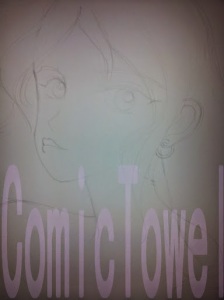
Cut. Clipped. Edged out of a piece of Bristol board to draw a smaller picture. Or what initially was going to be a mini-comic that just wouldn’t… mini! So instead, I sketched a quick drawing. As always, I found conflict with what to do with her hands. Nonetheless, I went for the simple and clean approach.
The inking followed. With no specific character in mind, I tossed around her eye color until I just decided to make them a limey green. And because she’s a person of color, I shadowed her a Copic Deep Orange. At first I wanted to leave her lips without lipstick, to instead go for a Copic Flesh Pink tone. But later, as you’ll see, that simpleness went out the window. Fact is, I love my girls flashy when it comes to lipstick, nail polish, etc. Anything outside of that seems… well… basic.
Now comes one of my favorite parts: scrapbook implementations. I’ve had this slice of cherry-themed paper for a while. It’s smaller than my usual pieces, so it’s hard to use on bigger projects. But since this was a smaller drawing–on a smaller piece of Bristol board–it fit perfectly. And because it’s been years since I use dollies, I thought adding the two would work this go-round. As always, I X-Acto Knifed her from the negative space. Which, thankfully, wasn’t much nor complicated.
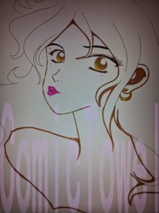
Color. Color. Color. Paint and pastels. Layers on layers. Where to start? Okay. Her eyes have my traditional gradient effect. The theme–as mentioned–is lime. Lips colored soft pink alongside a darker shade of pink for her nails. Her skin tone has a soften blend of clay-colored chalk pastels mixed with a peach. To be honest, I had these scrapings (I used my X-Acto Knife to scrap chalk pastels into a pallet before blending) left over from my last drawing HERE. I saved them, and had just enough for this girl. I water colored her hair purple, which is tradition for me when drawing characters with dark hair. Following the watercolor, I spotted her hair with black chalk pastel. It always looks a little rustic look until I blend.
More layers. Gave ground to her pupils, and an iris effect where I black-dot around her full iris (not sure where I learned that from). Also, and it’s been a while, but I added eye shadow using a soft rub of pink chalk pastels. Too much? Maybe. I followed my tradition of using three colored pencils to streak and layer her hair. But I felt like I missed the flow around the part where she tucked her hair behind her ear. There needed to be some definition on where that piece of hair broke from the rest of the flow. So you can see where I added a darker line to separate the two. But from there, I got into this mood of using the black colored pencil to begin adding more fullness by shading her hair more with it. Experimenting I guess.
So yeah. Basically got to the final step, scanned, and realized she wasn’t complete. Pulling the drawing out of the scanner, I add the stickers. I’ve always wanted to use these–as the majority of them were featured my older project HERE. The left overs made it to this girl in the form of a cherry earring and floating fruit. In other words: CUTENESS IN EFFECT! No, for real. I love stuff like floating fruit.
But yes. In its digital process I added:
1. Revived her color for the digital look.
2. Retracing and filling her outline and other dark areas outside of her hair.
3. Filling her lips and nails with color before highlighting their shine with a touch of white.
I believe that’s just about it. So what should her name be?
Also, you can buy a journal featuring this drawing at my Zazzle Store HERE!
Beware: another Michael's haul. This was the first place I hit today. Mainly after expressing how aggravated I was with myself for not picking up crafts glue on my last visit. I got something close this time–and it was on clearance ($5.49 to $2.99). Elmer's X-Treme School Glue should do the trick. The question is whether it dries near-clear or as a puff of white. We'll see. Probably wouldn't matter at the end of the day. Now this may sound silly, but I'm kind of sad the crafts glue I've held on for over ten years is now finished. It got me through many a drawing project over the years. (Yes, I get attached to inanimate things like that. What about you other cartoonist out there?)
Anyway, I mentioned in my last drawing post how I originally wanted to give the character a black background. Unfortunately, my acrylic ink was not a thing but dust. I got this Winsor & Newton tube for about $4. I like its color's name: Mars Black. Pretty neat name. Though I don't associate black with Mars. Cool name anyway.
Now. On to scrapbook paper. My favorites. Each of these slices of scrapbook paper costed me .19. Wait, only the Yellow Rose slice was .59. Nonetheless, ever so natural for me, they all came out of the clearance well. (For real people, don't sleep on the clearance racks.) Still, I was glad to find the dark, masculine slices. What looks black is called Bitter Chocolate. The brown: Mocha Divine. (You can't tell, but they're stocky and lightly ribbed.) The two grey pieces are called Gray Floral Scroll.
Seems like Michael's employees are always issuing out coupons, so I saved $2.
Still didn't find that acid-free tape, though. After about twenty minutes, I had to make a run for it before I really got started picking up whatever caught my eye.
So, until later, we'll see what I come up with for these goodies.
Oh what an interestingly long break I took from actually drawing a cartoon. Ridiculously long, rather. Actually, chalk my inactivity up to laziness. But I’m back in form. Spurred by my new found freedom to do what I want to do with my immediate time. (We’ll save that story for another day.) I’ve been sitting on this no-body character for months, before I lit a fire to do something with it. Lots of sketching, erasing, playing around with different poses took place. Soon I got to this selfie-taking, disco-spinning point. My original inspiration was this picture of singer Laura Branigan. I’m a huge fan of this long-gone and underappreciated singer from the 80s and early 90s. So, spinning through her records (well MP3 files), I searched for a picture of her to embody in my own cartoons. And I liked this one. So I got started, took that long no-drawing break I mentioned, and never actually broke through to my inspired thought. Except for sketching the tousled hair, I abandoned the drawing. I had a hard time getting her body down. Then again, I’m not great at bodies. But I gave it a good go...
The pencil and sketching part is where I usually spend most of my time–and expelling frustrations. As mentioned, lots of erasing, redrawing, and standing before a mirror to calculate proportions. Which is beyond my skill as far as I’m concerned. But I love a good challenge. Good or bad, sometimes I just brush my frustrations aside and just go for it. I’ve long stopped battling drawing insecurities. Really, you have to close the lid on it after a point. Or you’ll never get anything done while stuck in the process. I’ve mentioned this before, but your love for the craft will always be inside searching for another opportunity. Another burst of inspiration to express. So if you find yourself battling with insecurities about your skills, ignore it. Draw anyway. Go for it. And give your next effort your best. And the one after that. And after that. And so forth and so on.
I never really have a direction once I get pass the sketching phase–color and material wise. I don’t know which character speaks to me. Meaning, what hair/eye color I’ll need. As well as who fits what I kinda-sorta have in mind to convey the drawing (as well as which personality fits). I love combining crafting materials with drawings–with is apparent to those familiar with this blog. But something about this glittery sheet called me. I bought it two years ago, and I suppose for a occasion such as this. Seeing how the imagine draws inspiration by Brangian, it makes a fantastic 80’s disco-jammy top. The tousled hair from performing and the endorphin-heavy selfie to boot! Notice I gave her bottom eyelids some sharpness ala Diana Ross's album cover for Surrender. Not too much, but just a touch. (Hair was a bright, canary yellow watercolor. Shading done with "Baked Clay" Copic Marker.)
Speaking of Diana Ross, before I get into the next step I decided the character would be my girl, Towel. (My original baby.) They’re cartoons, so I give them any kind of name. With that said, a lot of people who’ve asked me about her thinks she’s a tanned white girl. The truth is actually the opposite. She’s black, having dyed her hair (her cousin Brooklyn’s idea.) I’m not into conventions and traditions when it regards appearances. I love individuality and differences. Things that aren't suppose to fit. Besides, Beyonce and Tamar has done the same with their heads. Now I'll proceed forward speaking on the usual, triple-layer gradient effect for her brown eyes. I didn’t use a blending pencil this time.
Per normal, I kind of struggled with chalk pastels when it came to nailing her complexion. I used a clay and a peachy blend–which is the safest balance for her tone. Balance is necessary; the darker the complexion, the less you can get away with blotchiness. And my drawings come LOADED with missteps. As seen. I would later have to go over her complexion with another round of pastels to even everything out.
I did her hair different this time. Instead of using a chalk pastel one tone up from the yellow base coating, I used a tan. (Carved the simple shirt outline out.)
I’ve had one bottle of craft’s glue since 2001! And when I went to glue the glittery sheet behind the board, nothing came out the bottle. No more glue. Which was a good thing because it would’ve been a pain. So I just taped the sheet down, which was a pain as well because my tape is so old it breaks as I peel. And to think, I left Michael’s last Saturday knowing I needed more than what I left with.
I added the third layer to her hair through a blend of three color pencils. Well, four counting the black I used to fill her roots. But I had concerns during the process. One: her hair was tousled and uneven. I didn’t know whether to regret it or fix it by adding more to her right side. Eventually, I said forget it. Perfection sucks and the story is she just left a performance where she was serving all kinds of vocal tease. Two: I couldn’t find its movement and flow as I added more streaks. So I did what I could. As for her cell phone: black marker for the back and a silver color pencil for the boarder. I knew I would embellish it later. A nice shade a pink filled her nails and lips.
Now, I got to remember what I added to this part of the process. OH! The background. I thought about a black background with a light effect via chalk pastels. I thought about adding another scrapbook sheet. Then, which happens often, I thought about how much I wanted to keep working on her instead. So I just painted it canary yellow and used pink chalk pastels to give her a iridescence that’s not so. To give her outfit form, I used a black marker to show the curve and folds. Then realize another round of disproportions and said “F” it and kept going. Telling you guys, you gotta just keep going.
The embellishing part is my favorite. I don’t know if I mentioned this before, but I once had an art teacher tell me to stop adding stuff to any of my drawings. I told him I’ll do what I please. I'll make mistakes and change my mind accordingly. If possible. In this case, I pulled those black chalk stickers off. It just… didn’t really work. I wanted to use them, but found it unnecessary for this particular drawing. Yet, I left the bejeweled necklace and earrings (all my girls have to wear jewelry). Of course, I added some to the back of her phone as well.
Okay. Okay. Okay. The not-so final product. Or almost. There’s so much I have to say about how I got here. Changes and all. So I’ll bullet point them for my own organization of thought.
1. My scanner only scans so much. That’s right. This was as much as I could capture. I’ve had the scanner for years and just never upgraded. You know, money and all. But, fact is, I like it. I’m all about face in the drawings, so I served. I had to choose between showing her hair or the cell phone more. Obviously I picked hair! As I live for a girl with locks and flow.
Now I tried to take the image on my phone (like the ones I shown of the process) and work from there. Yet, it didn’t turn out how I liked so I stuck with the scanned image. Until I can upgrade, I just have to use this. I lost a lot of the story, but still gave face.
2. As always, I revived its color in its digital format. Also, as mentioned, I went back and added more to her complexion. My first blending wasn’t that great in the original digital image.
3. I darkened her outline on the computer. I kept looking at the image knowing something was getting lost in digital translation. It was her outline for sure. I may continue to add this step to the process of future drawings. Add digital gloss to lips/nail/phone and brightened up the eyes more. Computer work is out of my field, but I use it for the smaller things. Convenience.
4. I didn’t clean up the areas where I removed the stickers. We’ll claim "added style" as the results.
I believe that’s it. What do you guys think? I was up and down about it for various reasons. Part of it consisting of insecurities speaking. But then I looked. And looked. And realized I loved the pronounced dark outline and the way I blended her hair. She looks like a Barbie doll. And her shirt makes me want a strawberry crisp popsicle. Later down the line I'll look into making changes.
Evidently, (because I don't check my emails) Michael’s is having a 20% off Memorial Day weekend discount on all purchases. I didn’t know that until the cashier scanned a coupon for me, turning my total from $20+ to $18. That seemed to be a positive sign from the Universe. Had I sat on my ass all day–hungry and confused about my next move–I might have missed such a deal. Nonetheless, running dangerously close to having absolutely no paper to draw on, I made a quick run and will now do another haul to show you guys what I like to work with. First, I needed another pad of Bristol board. Sometimes, I can’t imagine how I used copier paper before I discovered how necessary this type of paper is. It’s smooth and heavyweight. Furthermore, pencil and ink love it. Unless you're using some insane amount of unnecessary force, erasing doesn’t scratch up the board either. I forgot a vinyl eraser during my last haul, or at least one for the sketching process. I love vinyl because it does a clean job erasing, and can erase just about anything if you finesse just enough. So there aren't any pink streaks like with rubber erasers, or any gum crumbs from a gum eraser (which I do use for another purpose). As seen in the image, I use extra soft Facts white vinyl erasers. Last time I went to Michael's I ordered myself not to step into the scrapbook aisle. This time, I wandered in. I browsed around for a bit–my imagination going wild–and settled on two sheets of this brick-themed scrapbook paper. I got some cool ideas in mind for them. They were 59 cents apiece so I grabbed two just in case. One day, I’m going to let myself loose in the scrapbook aisle. Until then, I’ll try to use what I’ve already stashed. So that’s it. I made up a little from my last Michael’s trip. However, I wish I was willing to pay $36 for a portfolio, because I need one desperately. So for those who love to draw, I hope my personal go-to tools will come in use should you seek recommendations. I can’t wait to share whatever it is I come up with after using these three. Until then, always remember it doesn’t matter what you use, only that you complete whatever it is you’re doing!
No drawing description necessary. Or at least not with this one. This is what happens when you try to create your own ebook cover. You try and try again to find the right look. So far I've gotten two, and I think I'm sticking with the second one (saucy). The first one seemed to be going well, but it just didn't connect with me at the end. First, she just didn't seem to hit me as a black character. I didn't see that until the very end. And it's true when they say that sometimes drawings take on their own–we just have to listen to them. Second, I embellished too much around her eyes.
I realized that I should do all the embellishing through the computer. So I sauced her up some with a re-drawing to better fit the character. And I did all the extended work in PhotoFiltre.
However, the saucy image got to be too much also (should I share the original final version?). I got to make changes and keep her eyes simpler–as I'd learned my lesson the first time around.
Anyway, I'm on my way to work and wanted to keep this post quick. Any questions, leave in the comments. Also vote which do you think would make a cool ebook cover.
Here we are with "The Girl Who Wanted Illumination." Character named, Shi Shi. Last weekend I came across another bundle of scrapbook paper and bejeweled stickers that I wanted to use. And here we go with my first shot...
Sketched. A touch difficult at first. However, the basis was "something cute."
Filling in her eyelids, the heel of my hand came in contact with some drying spots. So by accident, I splotched her face a little. My immediate reaction was to take the drawing and crumble it all up. But I kept going. There's always ways around these things, right? Nonetheless, I left the drawing alone for the night after that situation.
Minimal watercolor in use. Though I began to think what exactly was I going to do for her backdrop. Should I paint it? Paint around her?
In the spirit of my last drawing, I took another slice of bristol board and painted it a soft black. All materials gathered, I knifed out her clothes. Or the potential areas for clothes.
Seeing that I would glue her onto the black-painted board, I used tape to keep her "clothes" together. Too much glue everywhere is messy. Anyway, stenciling out the pieces were a breeze. Not complicated this time around.
Lovely. Chalk pastels are all colored and in place. Soft blue for the hair and a peach tone for skin. Layers.
I do not like the way I streaked her hair. It was so wavy and wild that I lost control of its movement. Also, I think I should've called it a night at this point. I was ready to lay down.
I can't say this will be the final look. I had troubles losing its scale with my tiny scanner. So I used lighting and my phone's camera to get a larger scale. So I'm not sure yet. I work with what I have. Nonetheless, I revived her coloring which gave her this inner illuminating appeal. Extra sparkle to her eyes, etc. I'm still on the fence about this one. Small things I maybe didn't do as well as I hoped earlier in the process seems to show. But then I look back and think she's too damn cute! She reminds me of Aja from Jem and the Holograms.
This sketch came while I was at the library with my cousin and her daughter. I happened to bring a drawing pad and started sketching away. As always, I had no direction; just drawing. I only knew I was drawing a cute, youthful girl. Or so I thought. For about a week I wrestled with the sketch, standing before the mirror trying to figure out why it wasn't working the way I liked. I continued to go over and over the drawing until I realized that it wasn't a female character, it was a male. A spunky boy who needed a smirk and a high-collared cape.
Red-head was the first thing I decided. He was spunky, right. Green eyes followed. The rest I inked away. I tried to make a big–but not too dramatic–bejeweled collar. Don't know if I got it right, but I remove all kinds of pressure when drawing. Just let it flow.
I had black, textured felt in mind to make up the collar. So after I water-colored his hair orange, and shaded his eyes, I x-acto knifed the collar portion.
I initially wanted to water-color the background a deep red, saw this scrapbooking piece in a bag (the black-fading-into-red goth boutique look), and changed my mind. The trick was cutting around the outline of the collar, as I went about removing the negative space to fit in his backdrop. I still needed the shape of the collar as a guide, but thought I eventually could cut out the outline...
...But I kept it, coloring his collar's outline the same red as the cape. Having that outline of red just seemed to make it all pop just right. As you can see, it was all messy; so much so that I put a blank piece of paper underneath him to color everything with abandon. Nonetheless, once the water color dried, I laid a basic orange and red chalk pastel color to his hair and cape (once again, I love layers). As for his skin-tone–a light flesh color. He looks so English schoolboy here.
With all the screen and felt glued in place, I finally went about adding streaks to his hair with Prismacolor pencils.
Fill in the pupils; highlight the hair. This is actually the last shot from my camera, as opposed to a scanned form. I liked the scan version, but felt like my scanner was so small that I was losing lots of areas of the character. The jewels on his collar were cut out, as well as the cape's brooch. I did the same digital revive and retouch (or what I could, considering I'm nowhere near an expert) and added accents to the eyes so they glowed. Now, there may be an issue with lighting between the two versions, but the darker tint of the camera's shot kind of works with the theme.
Not in the strictest sense, but he seems Korean to me now.
In its entirety, the drawing has this whimsicalness to it that I love. A cool kid who likes bejeweled capes with high collars; learning toward vampirism and goth, but severely unlike either.
Thanks for stopping by. Visit Draw & Manga page for more.


