So here we go. My first virtual portfolio. Enjoy...
Monday, November 25, 2013
Virtual Portfolio 2002-2013
Hi, Comic Towel readers. To sort of semi celebrate the one year closing of my small blog, I played around with Windows Movie Editor to create a virtual portfolio of many of the drawings I've shared throughout this year. As I mentioned before, there was a point where I stopped drawing completely because I didn't know what to do with my drawings. Nobody saw them, tucked away in my personal portfolios. So as a newly "invigorated" individual, I realized it was time to pull them out and this time share them through whatever available platform. What's even more interesting is that these drawings span eleven years (2002-2013). That in itself marks a small sense of personal significance to me.
So here we go. My first virtual portfolio. Enjoy...
So here we go. My first virtual portfolio. Enjoy...
Tuesday, November 12, 2013
Drawing Cakes #2-4 Blog Post
Here we are with the coloring process that I use in my drawings. I've provided links in the above video that navigate from videos 2, 3, and 4. Please enjoy, share and comment.
With that said, here lies the coloring tools that I use:
With that said, here lies the coloring tools that I use:
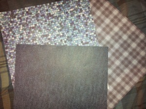
I usually combine drawing with crafting, so I wanted to make sure to point out that I love scrap-booking paper (as seen above). This type of paper comes in handy when you don't necessarily want to color/design a character's clothing or backdrop. It's also useful when you want to reach for something unique, different, and abstract to the eye. Now don't get me wrong, I love coloring in my own clothes and backgrounds; however, sometimes scrap-booking paper can do what I can't. They further help my vision come alive by popping with a different, dynamic set of colors alongside those that are hand produced. Sometimes they're tricky to use because you have to remove portions of the drawing to achieve the effect that you're after. But my goodness, when you get it right--you get it right. Especially with portrait-style drawings.
The brand of color pencils that I use are Prismacolor and, even more specifically, their soft core pencils. I use color pencils for a variety of techniques surrounding a drawing. However, the main purpose is for blending in the tones that make up the eye of the character. Example: If a character is blue-eyed, then I take three different shades of blue to create a gradient look to the eye. Nevertheless, I also use color pencil for small detailing and designing, but another important technique I use these for is character hair.
As seen in the video, I usually do a character's hair in four layers. I base paint it with water-color determined by the character's hair color of choice. (Note: if the character's hair color is black, I use a light purple or light blue base because black on black can come off as too heavy.) Then I use chalk pastels to further flesh out the color, giving it shape and dept. After this layer I find three shades of one matching color pencil, or two shades and an automatic black color pencil, to draw and add flair to the character's hair before the final layer of highlighting the character's hair via an eraser. This eraser layer gives the hair movement.
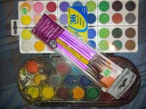
I love water coloring mostly for small details, filling large spaces, and background flourishes. Nevertheless, the majority of its us is for adding a base color to another layer of color using a different tool. Occasionally it's the opposite way around where I use another type of coloring tool (such as a coloring pencil) as a base and use water colors to fill everything in further. In any regard, I like water color because it's light enough for blending and strong enough that you can cover/color over certain areas that aren't coming alive like you'd hope. Furthermore, it's just fun!
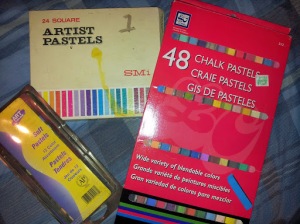
Chalk pastels are probably my favorite coloring tool. Back in the day these were the tools that really took my drawings to another level of applied techniques. And I've stuck with what I've learned till this day. See, I didn't have money for expensive markers and had to make due with what was available to me. Luckily, an old art teacher had an old set of chalk pastels that I could use to explore my passion with after she taught us a few tricks on using them during a school project. While chalk pastels can be messy (even ruining a drawing) and take careful use to control, the way they blend over wide spaces is just unbeatable, considering what I'm trying to achieve with a particular drawing. And because it can be a little too harsh when applying darker shades, you also have the added benefit of merging two different tones to keep a happy medium. There is just something soothing about blending with chalk pastels, which is why I've stuck with them despite their messiness.
---------------------------------------
Okay! Those are my coloring tools that I use. Occasionally, I find a reason to use oil pastels, crayons, and acrylic paint. I also have been known to use hair color spray and other scrap booking materials such as stickers and plastic gems. Once the drawing is scanned, I carefully decide whether or not it can use the Revive Color filter or not in my design program; physical and digital prints usual look differently to me.
Whatever it takes to honor a vision, I say.
And last but not least, a scan of the finally results from the video series Drawing Cakes...
 |
| Michael Yoon's Legend |
Thanks for reading and watching this series of posts and videos. I hope it inspires those who are looking for ideas. And just remember that when you express yourself through drawing--whatever that may be--remind yourself that you're a pipeline of ideas that will never dry up. Keep going. Keep exploring. Keep imagining. Don't let anyone tell you that what you envision and produce is less than another form of art. If it's in you, it's there for a reason. It's there to be expressed, not stifled down.
If you miss Drawing Cakes #1 post on inking, here is the link: http://www.comictowel.com/2013/11/drawing-cakes-1-blog-post.html
Tuesday, November 5, 2013
Drawing Cakes #1 Blog Post
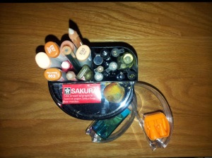
Okay guys, here is a little more details into the pencils, pens and markers I use to draw with. But first, you need a sweet container to carry all of them. Such as this cool one I found...
Little drawers for erasers and pencil sharpers.
Slim, compact, and easy access.
You need paper to draw on, naturally. Personally, I am enamored with Bristol paper. Matter-of-fact, I'm kind of obsessed with it. Before I used regular premium drawing paper. Then I discovered that the stock of Bristol paper works better for me. I like it because it works well with the crafting aspect of many of my drawings. Plus, there's just something reliable about this type of paper. Its hardness appeals to my drawing muse (^_^). This particular pad is from recycled paper, which is always great to pick from to "do your part".
Nothing but gentle block style erasers work for me during the sketching process. You definitely don't want to use anything super abrasive like Pink Pearl. White, clean, and gentle is the way to go. The same applies for the eraser pen that helps with small lines. I have two pencil sharpeners. One seems to work better with the color pencils I use while the other for regular drawing pencils. Other than that, I lose sharpeners a lot. Because I mix drawing with crafting, I also have an X-Acto Knife handy. You'll soon see why.
The start of every sketch: pencils. With the exception of the two blending pencils (those with the white tips), I use the lightness of H and 2H pencils. Something like 2B or beyond 2H is entirely too harsh for me. The difference is the lead in the pencil. The higher the number and letter combination, the stronger the lead is in the pencil. So H and 2H has a softer lead material than something like a 9H drawing pencil. You could say that I like to sketch almost invisibly, but I'm always mindful of possible lines dug into the paper because of hard sketching. While I do have a mechanical pencil shown here, I rarely use it. I love my wood and lead combo. Therefore, H and 2H remain my favorite sketching pencils.
Time for ink. But first I should share something you should be aware of before you move from the sketching stage: LOOK AT YOUR SKETCH THROUGH A MIRROR! That's right. Take your sketch and look at it through a mirror. Through its reflection, you will see just about every uneven line, swoop, or curve that your eye doesn't catch otherwise. I learned this a long time ago. It works especially for someone like myself who loves to draw portraits of pretty manga-inspired characters. Nevertheless, I wouldn't be so hard on myself should I miss something. Sometimes you got to let mishaps be.
This here is a small collection of the ink pens I use after a sketch. I do have a calligraphy pen that holds speedball types A, B, C, D. It's fun dipping into India ink, but I haven't used it in a while because I don't care too much for the grip. It's not too necessary. This set here is helpful because each tip provides a different gradient for what you want to achieve in your drawing. If you want a really heavy line, you'll use a 1.0mm sized pen. A little thicker? Try the 0.6mm pen. The Faber-Castell pen at the top uses India ink and its marked with B for Big or even Bold. Because I bought this brand in a kit, there is also an M for Medium and S for Small and XS for Extra Small.
The funny thing about many of the pens here is that the smaller pens dry out to quickly. Which is fine because the best--and absolute BEST--inking pen is...
...this one! I got a close snapshot of the name and style. You can take a note and buy it at Wal-Mart (that's right) in a two-pack deal. This pen is amazing. For someone who sketches neatly and inks just as neatly, this pen saved me a lot of headache because I don't color as neatly. The tip is so fine, so precise (as the pen states), that it just makes your inked sketch look so delicate and clean for color. I could go on and on about this pen, but I won't. A funny observation I noticed is that it dries slower on paper than a lot of the other pens I mentioned. Therefore, give yourself a second after inking to erase pencil lines.
Everybody who is inspired by manga art knows about Copic Sketch markers shipping over from Japan. People use either Copic or Prismacolor. I own a few of both, and yeah, Copic is probably my most preferred. Why? Mainly because they don't dry up nearly as fast as Prismacolor and they are superior for blending with my other coloring methods. That's just my experience, though. Needless to say, both brands are expensive--and rightfully so considering how amazing they are. Thankfully, I don't use either to color my drawings (the next post will be dedicated to my coloring methods), and that's not because I am too cheap. I'm simply not a fan of using markers to color entire drawings. I don't like the back-and-forth of markers over wide spaces, if that makes sense.
With all that said, I own only flesh-tone Copic markers that I use for shadowing and outlining characters. I'll be sharing this in the next video.
Thanks to those who read all of this and please feel free to share any ideas, methods or drawing tools.
The next post and series of videos on coloring can be found here: http://www.comictowel.com/2013/11/drawing-cakes-2-4-blog-post.html
Subscribe to:
Posts (Atom)
