Showing posts with label Coloring. Show all posts
Showing posts with label Coloring. Show all posts
Thursday, June 9, 2016
Sunday, April 17, 2016
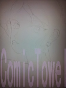
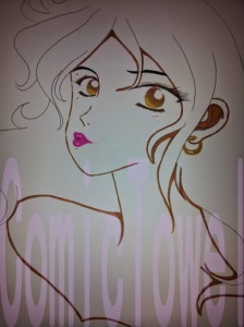
The Girl Who Lime-Eyed


But yes. In its digital process I added:
1. Revived her color for the digital look.
2. Retracing and filling her outline and other dark areas outside of her hair.
3. Filling her lips and nails with color before highlighting their shine with a touch of white.
I believe that’s just about it. So what should her name be?
Also, you can buy a journal featuring this drawing at my Zazzle Store HERE!
Saturday, March 26, 2016
The Girl Who Channeled 80's Branigan
 Oh what an interestingly long break I took from actually drawing a cartoon. Ridiculously long, rather. Actually, chalk my inactivity up to laziness. But I’m back in form. Spurred by my new found freedom to do what I want to do with my immediate time. (We’ll save that story for another day.) I’ve been sitting on this no-body character for months, before I lit a fire to do something with it. Lots of sketching, erasing, playing around with different poses took place. Soon I got to this selfie-taking, disco-spinning point. My original inspiration was this picture of singer Laura Branigan. I’m a huge fan of this long-gone and underappreciated singer from the 80s and early 90s. So, spinning through her records (well MP3 files), I searched for a picture of her to embody in my own cartoons. And I liked this one. So I got started, took that long no-drawing break I mentioned, and never actually broke through to my inspired thought. Except for sketching the tousled hair, I abandoned the drawing. I had a hard time getting her body down. Then again, I’m not great at bodies. But I gave it a good go...
The pencil and sketching part is where I usually spend most of my time–and expelling frustrations. As mentioned, lots of erasing, redrawing, and standing before a mirror to calculate proportions. Which is beyond my skill as far as I’m concerned. But I love a good challenge. Good or bad, sometimes I just brush my frustrations aside and just go for it. I’ve long stopped battling drawing insecurities. Really, you have to close the lid on it after a point. Or you’ll never get anything done while stuck in the process. I’ve mentioned this before, but your love for the craft will always be inside searching for another opportunity. Another burst of inspiration to express. So if you find yourself battling with insecurities about your skills, ignore it. Draw anyway. Go for it. And give your next effort your best. And the one after that. And after that. And so forth and so on.


I never really have a direction once I get pass the sketching phase–color and material wise. I don’t know which character speaks to me. Meaning, what hair/eye color I’ll need. As well as who fits what I kinda-sorta have in mind to convey the drawing (as well as which personality fits). I love combining crafting materials with drawings–with is apparent to those familiar with this blog. But something about this glittery sheet called me. I bought it two years ago, and I suppose for a occasion such as this. Seeing how the imagine draws inspiration by Brangian, it makes a fantastic 80’s disco-jammy top. The tousled hair from performing and the endorphin-heavy selfie to boot!
Notice I gave her bottom eyelids some sharpness ala Diana Ross's album cover for Surrender. Not too much, but just a touch. (Hair was a bright, canary yellow watercolor. Shading done with "Baked Clay" Copic Marker.)

Speaking of Diana Ross, before I get into the next step I decided the character would be my girl, Towel. (My original baby.) They’re cartoons, so I give them any kind of name. With that said, a lot of people who’ve asked me about her thinks she’s a tanned white girl. The truth is actually the opposite. She’s black, having dyed her hair (her cousin Brooklyn’s idea.) I’m not into conventions and traditions when it regards appearances. I love individuality and differences. Things that aren't suppose to fit. Besides, Beyonce and Tamar has done the same with their heads. Now I'll proceed forward speaking on the usual, triple-layer gradient effect for her brown eyes. I didn’t use a blending pencil this time.
Per normal, I kind of struggled with chalk pastels when it came to nailing her complexion. I used a clay and a peachy blend–which is the safest balance for her tone. Balance is necessary; the darker the complexion, the less you can get away with blotchiness. And my drawings come LOADED with missteps. As seen. I would later have to go over her complexion with another round of pastels to even everything out.
I did her hair different this time. Instead of using a chalk pastel one tone up from the yellow base coating, I used a tan. (Carved the simple shirt outline out.)


I’ve had one bottle of craft’s glue since 2001! And when I went to glue the glittery sheet behind the board, nothing came out the bottle. No more glue. Which was a good thing because it would’ve been a pain. So I just taped the sheet down, which was a pain as well because my tape is so old it breaks as I peel. And to think, I left Michael’s last Saturday knowing I needed more than what I left with.
I added the third layer to her hair through a blend of three color pencils. Well, four counting the black I used to fill her roots. But I had concerns during the process. One: her hair was tousled and uneven. I didn’t know whether to regret it or fix it by adding more to her right side. Eventually, I said forget it. Perfection sucks and the story is she just left a performance where she was serving all kinds of vocal tease. Two: I couldn’t find its movement and flow as I added more streaks. So I did what I could. As for her cell phone: black marker for the back and a silver color pencil for the boarder. I knew I would embellish it later. A nice shade a pink filled her nails and lips.

Now, I got to remember what I added to this part of the process. OH! The background. I thought about a black background with a light effect via chalk pastels. I thought about adding another scrapbook sheet. Then, which happens often, I thought about how much I wanted to keep working on her instead. So I just painted it canary yellow and used pink chalk pastels to give her a iridescence that’s not so. To give her outfit form, I used a black marker to show the curve and folds. Then realize another round of disproportions and said “F” it and kept going. Telling you guys, you gotta just keep going.

The embellishing part is my favorite. I don’t know if I mentioned this before, but I once had an art teacher tell me to stop adding stuff to any of my drawings. I told him I’ll do what I please. I'll make mistakes and change my mind accordingly. If possible. In this case, I pulled those black chalk stickers off. It just… didn’t really work. I wanted to use them, but found it unnecessary for this particular drawing. Yet, I left the bejeweled necklace and earrings (all my girls have to wear jewelry). Of course, I added some to the back of her phone as well.

Okay. Okay. Okay. The not-so final product. Or almost. There’s so much I have to say about how I got here. Changes and all. So I’ll bullet point them for my own organization of thought.
1. My scanner only scans so much. That’s right. This was as much as I could capture. I’ve had the scanner for years and just never upgraded. You know, money and all. But, fact is, I like it. I’m all about face in the drawings, so I served. I had to choose between showing her hair or the cell phone more. Obviously I picked hair! As I live for a girl with locks and flow.
Now I tried to take the image on my phone (like the ones I shown of the process) and work from there. Yet, it didn’t turn out how I liked so I stuck with the scanned image. Until I can upgrade, I just have to use this. I lost a lot of the story, but still gave face.
2. As always, I revived its color in its digital format. Also, as mentioned, I went back and added more to her complexion. My first blending wasn’t that great in the original digital image.
3. I darkened her outline on the computer. I kept looking at the image knowing something was getting lost in digital translation. It was her outline for sure. I may continue to add this step to the process of future drawings. Add digital gloss to lips/nail/phone and brightened up the eyes more. Computer work is out of my field, but I use it for the smaller things. Convenience.
4. I didn’t clean up the areas where I removed the stickers. We’ll claim "added style" as the results.
I believe that’s it. What do you guys think? I was up and down about it for various reasons. Part of it consisting of insecurities speaking. But then I looked. And looked. And realized I loved the pronounced dark outline and the way I blended her hair. She looks like a Barbie doll. And her shirt makes me want a strawberry crisp popsicle. Later down the line I'll look into making changes.

THE INSPIRATION!
Saturday, May 23, 2015
Another Michael's Haul

Evidently, (because I don't check my emails) Michael’s is having a 20% off Memorial Day weekend discount on all purchases. I didn’t know that until the cashier scanned a coupon for me, turning my total from $20+ to $18. That seemed to be a positive sign from the Universe. Had I sat on my ass all day–hungry and confused about my next move–I might have missed such a deal. Nonetheless, running dangerously close to having absolutely no paper to draw on, I made a quick run and will now do another haul to show you guys what I like to work with.
First, I needed another pad of Bristol board. Sometimes, I can’t imagine how I used copier paper before I discovered how necessary this type of paper is. It’s smooth and heavyweight. Furthermore, pencil and ink love it. Unless you're using some insane amount of unnecessary force, erasing doesn’t scratch up the board either.
I forgot a vinyl eraser during my last haul, or at least one for the sketching process. I love vinyl because it does a clean job erasing, and can erase just about anything if you finesse just enough. So there aren't any pink streaks like with rubber erasers, or any gum crumbs from a gum eraser (which I do use for another purpose). As seen in the image, I use extra soft Facts white vinyl erasers.
Last time I went to Michael's I ordered myself not to step into the scrapbook aisle. This time, I wandered in. I browsed around for a bit–my imagination going wild–and settled on two sheets of this brick-themed scrapbook paper. I got some cool ideas in mind for them. They were 59 cents apiece so I grabbed two just in case. One day, I’m going to let myself loose in the scrapbook aisle. Until then, I’ll try to use what I’ve already stashed.
So that’s it. I made up a little from my last Michael’s trip. However, I wish I was willing to pay $36 for a portfolio, because I need one desperately. So for those who love to draw, I hope my personal go-to tools will come in use should you seek recommendations. I can’t wait to share whatever it is I come up with after using these three.
Until then, always remember it doesn’t matter what you use, only that you complete whatever it is you’re doing!
Thursday, May 21, 2015
Battle of the Covers: Kidglove-style vs. Saucy-style


Kidglove-Style

Saucy-Style

No drawing description necessary. Or at least not with this one. This is what happens when you try to create your own ebook cover. You try and try again to find the right look. So far I've gotten two, and I think I'm sticking with the second one (saucy). The first one seemed to be going well, but it just didn't connect with me at the end. First, she just didn't seem to hit me as a black character. I didn't see that until the very end. And it's true when they say that sometimes drawings take on their own–we just have to listen to them. Second, I embellished too much around her eyes.
I realized that I should do all the embellishing through the computer. So I sauced her up some with a re-drawing to better fit the character. And I did all the extended work in PhotoFiltre.
However, the saucy image got to be too much also (should I share the original final version?). I got to make changes and keep her eyes simpler–as I'd learned my lesson the first time around.
Anyway, I'm on my way to work and wanted to keep this post quick. Any questions, leave in the comments. Also vote which do you think would make a cool ebook cover.
Sunday, May 3, 2015
Michael's Mini Haul
Hey-hey now! After work Saturday–which was hellish and something I refuse to get into–I got to spin around town and enjoy the rest of my day. From finding $5 books, to buying energy drinks that don’t energy, I eventually made a stop at Michaels Arts & Crafts. With pens drying up and erasers that has more erase than eraser, I did a quick inventory check in my head as to what I would need before I went in there and really lost my mind shopping. I knew I absolutely had to stay away from the sticker and scrap booking area. Since that’s where I usually go ham ‘n’ cheese in the wallet with ideas.

I think it’s apparent these are off-brand markers (Artist‘s Loft?), but I was good with that once I found them. I really needed some fine tip markers and ran across this 36 piece pack for $4.99. I only use markers for those small, precision details; and I really needed a brown marker, seeing that my current one was all dried up and buying a replacement was $2! So after options browsing, I settled on this pack to get what I need to get done.

More than anything, I needed a new ink pen. My lovely, lovely Precise V5 is on its last roll, causing the remaining ink to sputter out. I think everybody knows how much I love that pen for inking. I've been using that brand for years and can seem to find the pens at Wal-Mart. I don't think it’s a crafting pen, but what the hell.
So I got this Faber-Castell Black India Ink pen with the same 0.8mm nib. It’s not rolling ball, but its nib isn't prone to smudging and absorbs fast. It wasn't until I got home that I realized I’ve bought one of these Faber-Castell 0.8mm pens before. And from my understanding, it dried out before I ever really used it. Unless I used it up during an art course. Anyway, the pen was $3.99 so that had better be the case.
Lastly, I finally got a new eraser for everything but penciling. White eraser for pencil. Gummy eraser for pastels. Then I got home and realized I needed a new white eraser too. So is life. Anyway, this tri-tip eraser was $1.99. I love that it does have three tips because that'll help with precision, and keep me from chopping off smudged pieces from previous erasing endeavors.
I think I budged well. All this for $11.96. Anyway, buying art supplies is an investment, right? I still need another pad of bristol board and a portfolio. Maybe next time.
Hope you guys continue to have a great weekend! And keep drawing. No matter how good or how bad you think you are, always ART!
Wednesday, April 15, 2015
The Boy I Tried To PNG (Test Run)
This post/drawing came with a technical purpose. It’s my attempt to create a PNG image (portable network graphic or transferable images with no accountable backdrop) out of one of my drawings. I came up with this idea because I wanted to make T-shirts featuring my characters–after some previous failed-looking attempts. The thing is that it looked weird sporting an entire drawing onto a shirt. It almost looked plopped on, with a hefty “there.” It just didn't look right having an entire portrait drawing on a shirt, though outside of Zazzle's digital design tool it may appear differently. Needless to say, I couldn't do anything with all of that.
So I had this random, unfinished sketch hanging around. I decided to get modest (is that safe to say?), sloppy and hurried in my attempt to flesh this bald guy out and transfer him into a simple PNG file to test myself. And it worked; rough and rocky, but I managed. Added to that, I decided to double this into another drawing post/video tutorial. Though I cringe at the actual drawing. But like I said, he had a purpose. I made sure his expression revealed such.
At the end of the post comes the video version...
Simple and clean. Nothing fancy. Including no hair.
For darker complexion, I'd normally add a second layer. Not this time. On to its purpose.
Saturday, February 28, 2015
The Girl Who Dreamt of Earl Moran
She has a name, and it’s Emiko (although I conceptualized her, her surname escapes me at the moment). Japanese? Absolutely. And she dreamt of posing for famed pin-up artist Earl Moran. Or, at least, that’s what inspired all of this; the blueness and semi-sailor look. Oh, also the binoculars that don't exactly look like such (who ever said I could draw inanimate objects anyway?). I have a book on famous pin-up artists, and I use it whenever I want to draw something but am uninspired by anything. So, I take to that book during dry spells. And considering I've promised myself that I would try to draw a new image once a month for 2015, I landed on Earl Moran's chapter. And since today is the last day of February, I’ll let the process images do most of the talking as I try to post this before midnight. Enjoy and comment below. And the image source is HERE!

The usual penciling process. Sometimes I hate this part because my OCD really kicks in–knowing that if I don't get it right, it's all done for. While I'll never be 100% accurate or get my proportions right (who needs them in comic and cartooning?), I do use my handy bathroom mirror to reflect the sketch back. That way, I'll catch some of the obvious little misalignments.

The inking part, of course.

Copic markers for shading and outline. I've always done this however way. So not into light sources.

Ah, the stenciling and scrapping part.
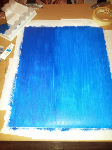
I took another piece of bristol board and painted it blue. A seafaring blue (whatever that is). The point was to make her backdrop look something like the side of a boat. I'm going for a theme here.

Dying to use this particular material; I turned her scooped out parts into a shirt.

More color, more pizazz. I almost didn't get through this, as I was entranced with catching up with How to Get Away with Murder. Man! They gave us two episodes this week and they were soooooo good. I don't think I even ate yet.

I taped the shirt down, seeing that another layer would be added. Then glued her down to the backdrop. Neither were as much of a mess as I anticipated.

All done! Scanned, revived, retouched a bit. Since I'm not a computer person, I did what I could. Anyway, Emiko is happy. Her usual prickly disposition does not show. I haven't drew her in a long time and have been thinking about her as of recent. Here's to my girl.
THANKS FOR COMING ABOARD!
Saturday, January 24, 2015
Zazzle Unboxing! BOOM!
I got some still images for ya!

Click HERE For Mousepad Link


As always, thanks everyone for coming aboard.
Subscribe to:
Posts (Atom)