Showing posts with label Portfolio. Show all posts

Monday, May 2, 2016

Getting the Hang of Zazzle


I’ve been going up the wall lately on optimizing a controlled and organized Zazzle store.  Before products were arranged in any and all kinds of order.  This left visitors scrambling all over the store.  Which isn't good!  Even I came frustrated with the disarray I’d created.  Added to my organizing, I’ve also been reviving the color of my original uploads from 2012.  A few color correcting techniques in the drawing process have stepped up since 2012.  So the difference from then and now were a little too noticeable for me to ignore.  
I wouldn’t call it grueling, but I’ve been up until like 4am all weekend redoing all my previous faults.  I think we've all been there, where it's late but we tell ourselves just one more action before we sleep.  Then one action leads to ten.  
So here are a few of my considerations to optimizing a fresh Zazzle store.

Monday, March 28, 2016

He Needs the Michael's (Crafts Haul)


Beware: another Michael's haul.  This was the first place I hit today.  Mainly after expressing how aggravated I was with myself for not picking up crafts glue on my last visit.  I got something close this time–and it was on clearance ($5.49 to $2.99).  Elmer's X-Treme School Glue should do the trick.  The question is whether it dries near-clear or as a puff of white.  We'll see.  Probably wouldn't matter at the end of the day.  

Now this may sound silly, but I'm kind of sad the crafts glue I've held on for over ten years is now finished.  It got me through many a drawing project over the years.  (Yes, I get attached to inanimate things like that.  What about you other cartoonist out there?) 
Anyway, I mentioned in my last drawing post how I originally wanted to give the character a black background.  Unfortunately, my acrylic ink was not a thing but dust.  I got this Winsor & Newton tube for about $4.  I like its color's name: Mars Black.  Pretty neat name.  Though I don't associate black with Mars.  Cool name anyway.

Now.  On to scrapbook paper.  My favorites. Each of these slices of scrapbook paper costed me .19.  Wait, only the Yellow Rose slice was .59.  Nonetheless, ever so natural for me, they all came out of the clearance well.  (For real people, don't sleep on the clearance racks.)  Still, I was glad to find the dark, masculine slices.  What looks black is called Bitter Chocolate.  The brown: Mocha Divine.  (You can't tell, but they're stocky and lightly ribbed.)  The two grey pieces are called Gray Floral Scroll.
Seems like Michael's employees are always issuing out coupons, so I saved $2.
Still didn't find that acid-free tape, though.  After about twenty minutes, I had to make a run for it before I really got started picking up whatever caught my eye.
So, until later, we'll see what I come up with for these goodies.

Thursday, May 21, 2015

Battle of the Covers: Kidglove-style vs. Saucy-style


Kidglove-Style


Saucy-Style


No drawing description necessary.  Or at least not with this one.  This is what happens when you try to create your own ebook cover.  You try and try again to find the right look.  So far I've gotten two, and I think I'm sticking with the second one (saucy).  The first one seemed to be going well, but it just didn't connect with me at the end.  First, she just didn't seem to hit me as a black character.  I didn't see that until the very end.  And it's true when they say that sometimes drawings take on their own–we just have to listen to them.  Second, I embellished too much around her eyes.  

I realized that I should do all the embellishing through the computer.  So I sauced her up some with a re-drawing to better fit the character.  And I did all the extended work in PhotoFiltre.

However, the saucy image got to be too much also (should I share the original final version?).  I got to make changes and keep her eyes simpler–as I'd learned my lesson the first time around.

Anyway, I'm on my way to work and wanted to keep this post quick.  Any questions, leave in the comments.  Also vote which do you think would make a cool ebook cover.


Tuesday, October 21, 2014

The Creative Print House Experience


What‘s up, Comic Towel readers?  I’m here to spread the word about another custom print-on-demand site you can visit online to have your drawings, photos and images printed on items such as phone cases, coffee mugs and tablet cases.  I was given the opportunity to review Creative Print House a couple of weeks ago when a representative from the company reached out after seeing–what I presume–my video reviewing products I received from other custom printing companies.  Considering I featured phone cases in the video, it was decided that I would receive three to review.  First, let me walk you a little through the creating process I took.

Phone Case & Options


I decided to choose three styles of phone cases; iPhone 6 Plus (5.5 inch) White Rubber Case, IPhone 6 (4.7 inch) Clear Rubber Case and Samsung Note 3 (5.7 inch) Black Rubber Case. Rubber cases are more durable than the options of plastic cases and wrap-around cases.  They're also kind of a blend of the two at the same time. Nevertheless, it should be said that not all case options are given to whichever type of phone you own. Therefore, some selections don't have the option of a rubber case. Luckily, each of the three that I chose had the rubber case option.  

You can also choose the color of your case, between black, clear and white options. These three colors aren't as extensive as a past mentioned custom print shop.  Nonetheless, the cases not only protect the phone (which I found CPH's protection better), but also provides the personalization you're looking for.  That's all the combination you need.

Also, I chose this image [above] to show both the prices (most cases range from $25 to $34) and the option to view a short video that showcases the actual cases. There's also an option to read and write your own review of the product.  

I found progressing through Creative Print House to be simple, intuitive and easy.  Not once did I feel overwhelmed with the selection process nor the designing.

Creating & Customizations


The design system is the fun part! You're taking your images and placing them on products; both personalizing and expressing who you are!  I wanted to share the above screenshot to show you how simple the process of customizing your phone case can be, as well as the available options to further the customization experience. 

Besides simply stamping your images on products, you also have the customization tools necessary to rotate an image to your preference, zoom your image, and control the space your image should contain on the item. As always, I filled the phone case with the image, removing all negative space. 

Additionally, available is the TEXT tool. Of course, I applied “Comic Towel” to the image, guiding its size by the scale tool before I changed the font and alignment of the text. Furthermore, there is the option of changing the text’s color and even its outline.  Really easy, really quick.  And another thing I noticed, I didn't have any difficulty with loading the image.  There was no need to create a file for collecting your images, it was all very streamline from your computer to the site.


Results


As it’s mentioned on Creative Print House, the images are printed in HD on an aluminum plate that’s attached to the actual rubber case. Unfortunately, that aluminum plate covers the speaker grill, and I have yet to test whether this is ineffectual or not. Nonetheless, concerning the image itself, I will say that I immediately noticed that it has lost some definition. Fine lines, tones, and darkened areas seem slightly blurred and faded.  It almost appeared as if the ink ran close to dry.  You probably can't tell from the snapshot, but in person, it's evident. Whether it's an issue with scaling the image too large (pixel count), the transference to the aluminum plating, or my own digital image, I can't be sure. I still think it came out beautifully, just not as sharp as I anticipated as it relates to the actual drawing [SEE HERE]. This, by the way, is featured on the Samsung Note 3 black rubber case.


This image is featured on the iPhone 6 clear case.  In this instance, the fine lines and definition came out sharper than the previous.  It still has a touch of fadedness, but the difference is that it didn't come across as a slight blur.  The image is a lot sharper.  To see the image click HERE.


I think that out of the three, this one came out the best.  Maybe it’s the available size, considering it's for the iPhone 6 Plus.  Maybe it’s the white case.  Whatever the cause, the end result was a lot more vivid and defined than the previous two.  To see the image click HERE  

I want to say that Creative Print House is best for those who are looking to create fun, personal photos and such printed on the available merchandise to share with friends and family.  As it continues to grow, that will change.  But as of now, if you want a deal on designing and personalizing your new tablet or cell phone case, this is the place where you need to be.  The process really was easy, and I got my items less than a week after I ordered them. 

You Decide

  • There isn't an option to create your own store featuring your designs on merchandise

  • There is an affiliate program which requires approval as well as your account email and password

  • Only 4 merchandising options: phone cases, tablet cases, mugs, and coasters (various styles in each)

  • A little less expensive than Zazzle and Cafepress, and shipping is free for orders over $25

  • Offers discounts and percentages off orders

  • Easier design options; simple and never too complicated to use

  • 30-day return policy and customer service available via phone and email

A super special thanks to Creative Print House for the opportunity.

Thursday, October 2, 2014

The Boy Who Loves Capes


This sketch came while I was at the library with my cousin and her daughter. I happened to bring a drawing pad and started sketching away. As always, I had no direction; just drawing. I only knew I was drawing a cute, youthful girl.  Or so I thought. For about a week I wrestled with the sketch, standing before the mirror trying to figure out why it wasn't working the way I liked. I continued to go over and over the drawing until I realized that it wasn't a female character, it was a male. A spunky boy who needed a smirk and a high-collared cape.


Red-head was the first thing I decided.  He was spunky, right.  Green eyes followed.  The rest I inked away.  I tried to make a big–but not too dramatic–bejeweled collar.  Don't know if I got it right, but I remove all kinds of pressure when drawing.  Just let it flow.


I had black, textured felt in mind to make up the collar.  So after I water-colored his hair orange, and shaded his eyes, I x-acto knifed the collar portion. 


I initially wanted to water-color the background a deep red, saw this scrapbooking piece in a bag (the black-fading-into-red goth boutique look), and changed my mind.  The trick was cutting around the outline of the collar, as I went about removing the negative space to fit in his backdrop.  I still needed the shape of the collar as a guide, but thought I eventually could cut out the outline...  


...But I kept it, coloring his collar's outline the same red as the cape.  Having that outline of red just seemed to make it all pop just right.  As you can see, it was all messy; so much so that I put a blank piece of paper underneath him to color everything with abandon.  Nonetheless, once the water color dried, I laid a basic orange and red chalk pastel color to his hair and cape (once again, I love layers).  As for his skin-tone–a light flesh color.  He looks so English schoolboy here. 


With all the screen and felt glued in place, I finally went about adding streaks to his hair with Prismacolor pencils.


Fill in the pupils; highlight the hair. This is actually the last shot from my camera, as opposed to a scanned form. I liked the scan version, but felt like my scanner was so small that I was losing lots of areas of the character. The jewels on his collar were cut out, as well as the cape's brooch. I did the same digital revive and retouch (or what I could, considering I'm nowhere near an expert) and added accents to the eyes so they glowed.  Now, there may be an issue with lighting between the two versions, but the darker tint of the camera's shot kind of works with the theme. 

Not in the strictest sense, but he seems Korean to me now. 

In its entirety, the drawing has this whimsicalness to it that I love. A cool kid who likes bejeweled capes with high collars; learning toward vampirism and goth, but severely unlike either.

Thanks for stopping by.  Visit Draw & Manga page for more.

Friday, September 19, 2014

Towel, the Girl Who Loves Sweets


I found this sketch while cleaning out a couple of sketchbooks, drawing tablets and portfolios.  There, tucked underneath a couple of bags from Hobby Lobby, lay this drawing.  I don't recall when I started it, or why I stopped.  I just looked at it and was suddenly inspired to create something sweet, using my favorite blond character, Towel (that's her nickname)!  The thing is that I fought the impulse to make changes to the sketch.  Instead, I wanted to act right away with the coloring process.  Didn't want to think too much.  Just wanted to grab the sketch and move.


As always, inking comes next.  My favorite Precise V5 pen did the grunt work.  Followed by a simple yellow Sharpie (yes, Sharpie) to outline her hair.  Last, I used a sand-colored Copic marker to outline and give a little shadow/shading.  I chose the skin-toned markers according to–you guessed it–skin tone.  And though she's blond, it doesn't mean she's a tanned blond.  Nevertheless, I always try to shadow lightly, throwing the whole concept of coloring "by light source" out the window.  I also used a flesh-colored Copic marker to guide her upper lip so I wouldn't lose the shape before I added a darker color.


Here, I water colored her hair a simple canary yellow.  And because her eyes are brown, I gathered my usual three-tones to give her eyes a gradient-like effect. Always more color!


X-acto knife ready, I carved away the negative space to get her ready for the felt, ice cream backdrop I decided to use.  I didn't glue her on right away because I knew that it would be a mess to do so first and then start using chalk pastels.  I also knew it would be a mess to add the chalk pastels and then use the x-acto knife to carve her off the negative space.  So for a while, I had me a cute paper doll tapped to my drawing board.


I normally use a dark toned pastel to match a character's hair, but here I used a matching yellow instead.  I coated her lips with a dark pink Prismacolor pencil.  These are my favorite pencils because of their soft, creamy tips.  As for the chalk pastel, used for her skin toned, I chose a shade of brown that I more or less liked when I first laid it down.  I managed to even it out by blending in a lighter flesh color, running a dry paper towel over the two to even her out.  Of course, I used a thin-tipped eraser to clean the edges.


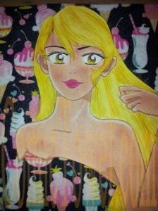
Three Prismacolor pencils used to add layers and effect to her hair.  A very light canary yellow, golden rod yellow, and an almost sienna brown were used.  Once the streaks of pencil are in, I use another dry paper town to blend it all in with the chalk pastel.  Then I use a gummy eraser to add highlights in long streaks.  I retook the Precise V5 pencil to fill in her pupil and mark some effect lines on the edges of her iris.  Lastly, I glued her to the felt, seemingly as if she came out of a pocket of space.


The digital scan.  But first, I added the usual whiteout shimmer to her lips and eyes.  I also added the cutie 3D stickers in support of the theme (sweets and ice cream).  The cherries work as earrings; the watermelon (hopefully) as a ring.  As for the drawing, I did the usual reviving of color the second I scanned it.  That seems necessary when a drawing moves into digital format.  I also cleaned up around her arm.  When I found the original sketch there were marks I had to work over that I knew during the process were going to need retouching.  I have yet to retouch her left eyebrow by slimming it down and back some.  And while her arm is a little shapeless, I decided to leave it as it is.  As I mentioned earlier, I didn't want to get into making adjustments to the sketching part; instead I jumped right in. 

Hopefully I didn't miss anything.  Yeah well, I know I did somewhere.  Anyway, thanks everyone for allowing me to share this!

 
Another on the way!

Friday, July 25, 2014

Slow Days in July

Just a few random pictures I took with my phone over the week.  My best friend and I were downtown eating and trolling through the open-air market and other historical sites when we remembered that we hadn't taken any pictures.  Combine that with my forgetfulness for writing this week's events down in my journal, and I decided to just post a few pictures on the blog as a means of cheating.


These lofts are kind of a dream home of mine.  I have a vision board, but this place isn't up there yet.  Nonetheless, it's at the forefront of my desires.  If PCH sent me a check (or I made good money from doing what I love), I would vouch for a top floor corner unit facing West.  Lots of natural air and light.

I always tell people that staying here would be the one reason to keep me in town while my heart sings to move Westward or three hours East (again).  Still, I really am fond of this dream I have of staying in this place.  For at least a year!


While it is terribly small and slow, I love my city's downtown area.  It's filled with not only historical homes/buildings, but also little alleyways and nooks perfect for exploring on foot.  Not to mention areas of cobbled road.  Oh, and ghosts!  Nevertheless, the area is growing every day.  The detective story I started writing two years ago takes place in a fictional downtown inspired by my own.

The building on the right was built in 1821 for cotton traders.  It's now a restaurant where you can get crispy skinned gulf red snapper for $31.  Needless to say, I just admire the building as I walk along.


A small area of historical homes and stores preserved as a museum and touring location.  If you're from here, chances are you took a field trip out here in the third grade.


The building we're standing on is where in July of 2004 (ten years ago exact) I went to apply for a job as an extra in a movie that was filming in our city.  For two long days I worked toward my screen "debut" as a military man waiting to board a train.  I got sprayed with a hosepipe as a form of rain, and ate Salisbury steak underneath a tent separate from the leading actors–which included Gabrielle Union and Billy Dee Williams.  That was super cool!   

A month or so later, I got a $110 check for my work.  It was a check that I desperately needed at the time because I didn't have a job.  In any regard, being an extra in a movie was a great and treasured event.

That's all I got for now.  Thanks, everyone for stopping by.  I really didn't want to let this pictures stay tucked away in my phone. (^_^)

Monday, June 23, 2014

The Gold Fleur

Hi, everyone.  Blogger has been acting a straight fool lately and I've been impatient with it.  I don't know what the issue is, but nothing’s loading properly--including this new blog post on my latest drawing.  Nonetheless, I think I'm there.  I think it’s doing its job, and now it’s time to share my process again through a series of images.

I've named this image Fleur.  The character’s name is still unavailable to me.


I sketched the actual drawing probably three months ago and just left it, for some reason. Therefore, I don’t have the penciled version. Nonetheless, as of recently, I went through the process of inking the drawing and adding all the particular areas that would require shading/shadows regarding the flesh (I use Copic markers for this). Besides using the usual colored pencils to add tones to the eyes, I also used a screen/pattern early within the process as the backdrop. Because the process only gets messier, I try to have this construction part out of the way as early as possible. Anyway, at first I meant to apply the screen/pattern as the shirt, and then realized there wasn’t enough paper. I like it better as a backdrop, though. So having carefully carved out the negative space, I added it on as needed.


Now on to the colors. Water coloring is always my base of choice because it’s light and covers space quick and easily. Because I decided his shirt would be yellow—in semi-accordance with the gold fleur de lis within the backdrop—I painted it a light yellow. Just as his hair would be brown, I gave it a light-brown color. However, as seen, I covered the hair with a dust of brown-toned chalk pastels before I applied the yellow chalk to his shirt. I’m all about layers. Get the base color, and then add more and more colors!


Because I like layers, I try to add the darkest color first when it comes to chalk pastels. Why? Because it can get messy. Adding the dark color first allows me to clean up the edges before applying lighter colors. As seen in this image, I added a yellow chalk pastel to his shirt as well as a flesh color to his skin tone. As for the hair, it was time for a layer of colored pencils toned and streaked through his hair to give it vibrancy (I eventually use a tissue to blend the three mediums that layers the hair). Furthermore, I used wooden beads and brown string to craft the drawstring area of his shirt. As for his undershirt, I applied a ragged piece of actual denim to give it form.


Almost finished. I streaked his hair with a gum eraser as a form of highlights, and then gave sparks (an actual whiteout pen) and further flourishes to his eyes and the glisten of his lips. On the crafting aspect, I used more string to construct him gently gripping a necklace consisting of bejeweling stickers, and a gold cross sticker. I went through several designs of the cross from what I had available before I decided to stick with a gold one. This cross, in particular, matches his earrings, which are also stickers taken from the same batch.


The final part. Immediately, after I scan a drawing, I revive its color in PhotoFiltre. Hey, it’s all I got. The reason I do so is because digital images come out differently than the original. So I found it best to give some digital brilliance to the colors. Nevertheless, because the image is further decreased to portrait size, I also made corrections and adjustments. One of those corrects were to brush a matching brown color over the wooden beads that makes up the drawstring of his shirt. This was to cover the dry crafts glue peeking out. Other adjustments called because certain aspects tugged at me. Like his lips. I brushed over the glisten I originally intended, deciding it looked best without. I also touched up the glisten in his eyes by applying a softer gray over them to bring down the brilliance. Sometimes you have to make little adjustments as the digital image always looks differently than the actual one. A little clean up in an otherwise never-perfect drawing.

I have about four other images I’ll be sending off before turning them into journals and other items on my Zazzle shop, this one included. Until then, let’s come up with a name for him.

I sometimes get message from people asking me what inspires me to draw in this style.  Then there are some who pinpoint it right away.  In any regard, I idolize Naoko Takeuchi (Sailor Moon) and Miwa Ueda (Peach Girl) and their shojo manga drawings.  I love the youthfulness, softness, and simplicity of shojo-themed drawings.

Monday, November 25, 2013

Virtual Portfolio 2002-2013

Hi, Comic Towel readers.  To sort of semi celebrate the one year closing of my small blog, I played around with Windows Movie Editor to create a virtual portfolio of many of the drawings I've shared throughout this year.  As I mentioned before, there was a point where I stopped drawing completely because I didn't know what to do with my drawings.  Nobody saw them, tucked away in my personal portfolios.  So as a newly "invigorated" individual, I realized it was time to pull them out and this time share them through whatever available platform.  What's even more interesting is that these drawings span eleven years (2002-2013).  That in itself marks a small sense of personal significance to me.  

So here we go.  My first virtual portfolio.  Enjoy...

Total Pageviews